The year is over in a few hours and I thought it would be nice to do a quick review of the year, revisit some studies and the most popular posts of the year, as well as share some thoughts on my performance in 2013 and my goals for 2014.
Revisiting Old Studies
IBS
IBS did pretty badly in 2012, and didn’t manage to reach the amazing performance of 2007-2010 this year either. However, it still worked reasonably well: IBS < 0.5 led to far higher returns than IBS > 0.5, and the highest quarter had negative returns. It still works amazingly well as a filter. Most importantly the magnitude of the effect has diminished. This is partly due to the low volatility we’ve seen this year. After all IBS does best when movements are large, and SPY’s 10-day realized volatility never even broke 20% this year. Here are the stats:

UDIDSRI
The original post can be found here. Performance in 2013 hasn’t been as good as in the past, but was still reasonably OK. I think the results are, again, at least partially due to the low volatility environment in equities this year.

UDIDSRI performance, close-to-close returns after a zero reading.
DOTM seasonality
I’ve done 3 posts on day of the month seasonality (US, EU, Asia), and on average the DOTM effect did its job this year. There are some cases where the top quarter does not have the top returns, but a single year is a relatively small sample so I doubt this has any long-term implications. Here are the stats for 9 major indices:

Day of the month seasonality in 2013
VIX:VXV Ratio
My studies on the implied volatility indices ratio turned out to work pretty badly. Returns when the VIX:VXV ratio was 5% above the 10-day SMA were -0.03%. There were no 200-day highs in the ratio in 2013!
Performance
Overall I would say it was a mixed bag for me this year. Returns were reasonably good, but a bit below my long-term expectations. It was a very good year for equities, and my results can’t compete with SPY’s 5.12 MAR ratio, which makes me feel pretty bad. Of course I understand that years like this one don’t represent the long-term, but it’s annoying to get beaten by b&h nonetheless.
Some strategies did really well:
 Others did really poorly:

The Good
Risk was kept under control and entirely within my target range, both in terms of volatility and maximum drawdown. Even when I was at the year’s maximum drawdown I felt comfortable…there is still “psychological room” for more leverage. Daily returns were positively skewed. My biggest success was diversifying across strategies and asset classes. A year ago I was trading few instruments (almost exclusively US equity ETFs) with a limited number of strategies. Combine that with a pretty heavy equity tilt in the GTAA allocation, and my portfolio returns were moving almost in lockstep with the indices (there were very few shorting opportunities in this year’s environment, so the choice was almost always between being long or in cash). Widening my asset universe combined with research into new strategies made a gigantic difference:

The Bad
I made a series of mistakes that significantly hurt my performance figures this year. Small mistakes pile on top of each other and in the end have a pretty large effect. All in all I lost several hundred bp on these screw-ups. Hopefully you can learn from my errors:
- Back in March I forgot the US daylight savings time kicks in earlier than it does here in Europe. I had positions to exit at the open and I got there 45 minutes late. Naturally the market had moved against me.
- A bug in my software led to incorrectly handling dividends, which led to signals being calculated using incorrect prices, which led to a long position when I should have taken a short. Taught me the importance of testing with extreme caution.
- Problems with reporting trade executions at an exchange led to an error where I sent the same order twice and it took me a few minutes to close out the position I had inadvertently created.
- I took delivery on some FX futures when I didn’t want to, cost me commissions and spread to unwind the position.
- Order entry, sent a buy order when I was trying to sell. Caught it immediately so the cost was only commissions + spread.
- And of course the biggest one: not following my systems to the letter. A combination of fear, cowardice, over-confidence in my discretion, and under-confidence in my modeling skills led to some instances where I didn’t take trades that I should have. This is the most shameful mistake of all because of its banality. I don’t plan on repeating it in 2014.
Goals for 2014
- Beat my 2013 risk-adjusted returns.
- Don’t repeat any mistakes.
- Make new mistakes! But minimize their impact. Every error is a valuable learning experience.
- Continue on the same path in terms of research.
- Minimize model implementation risk through better unit testing.
Most Popular
Finally, the most popular posts of the year:
- The original IBS post. Read the paper instead.
- Doing the Jaffray Woodriff Thing. I still need to follow up on that…
- Mining for Three Day Candlestick Patterns, which also spawned a short series of posts.
I want to wish you all a happy and profitable 2014!
Read more 2013: Lessons Learned and Revisiting Some Studies
DynamicHedge recently introduced a new service called “alpha curves”: the main idea is to find patterns in returns after certain events, and present the most frequently occurring patterns. In their own words, alpha curves “represent a special blend of uniqueness and repeatability”. Here’s what they look like, ranked in order of “pattern dominance”. According to them, they “use different factors other than just returns”. We can speculate about what other factors go into it, possibly something like maximum extension or the timing of maxima and minima, but I’ll keep it simple and only use returns.
In this post I’ll do a short presentation of dynamic time warping, a method of measuring the similarity between time series. In part 2 we will look at a clustering method called K-medoids. Finally in part 3 we will put the two together and generate charts similar to the alpha curves. The terminology might be a bit intimidating, but the ideas are fundamentally highly intuitive. As long as you can grasp the concepts, the implementation details are easy to figure out.
To be honest I’m not so sure about the practical value of this concept, and I have no clue how to quantify its performance. Still, it’s an interesting idea and the concepts that go into it are useful in other areas as well, so this is not an entirely pointless endeavor. My backtesting platform still can’t handle intraday data properly, so I’ll be using daily bars instead, but the ideas are the same no matter the frequency.
So, let’s begin with why we need DTW at all in the first place. What can it do that other measures of similarity, such as Euclidean distance and correlation can not? Starting with correlation: one must keep in mind that it is a measure of similarity based on the difference between means. Significantly different means can lead to high correlation, yet strikingly different price series. For example, the returns of these two series have a correlation of 0.81, despite being quite dissimilar.

A second issue, comes up in the case of slightly out of phase series, which are very similar but can have low correlations and high Euclidean distances. The returns of these two curves have a correlation of .14:

So, what is the solution to these issues? Dynamic Time Warping. The main idea behind DTW is to “warp” the time series so that the distance measurement between each point does not necessarily require both points to have the same x-axis value. Instead, the points further away can be selected, so as to minimize the total distance between the series. The algorithm (the original 1987 paper by Sakoe & Chiba can be found here) restricts the first and last points to be the beginning and end of each series. From there, the matching of points can be visualized as a path on an n by m grid, where n and m are the number of points in each time series.

Source: Elena Tsiporkova, Dynamic Time Warping Algorithm for Gene Expression Time Series
The algorithm finds the path through this grid that minimizes the total distance. The function that measures the distance between each set of points can be anything we want. To restrict the number of possible paths, we restrict the possible points that can be connected, by requiring the path to be monotonically increasing, limiting the slope, and restricting how far away from a straight line the path can stray. The difference between standard Euclidean distance and DTW can be demonstrated graphically. In this case I use two sin curves. The gray lines between the series show which points the distance measurements are done between.

DTW

Euclidean
Notice the warping at the start and end of the series, and how the points in the middle have identical y-values, thus minimizing the total distance.
What are the practical applications of DTW in trading? As we’ll see in the next parts, it can be used to cluster time series. It can also be used to average time series, with the DBA algorithm. Another potential use is k-nn pattern matching strategies, which I have experimented with a bit…some quick tests showed small but persistent improvements in performance over Euclidean distance.
If you want to test it out yourselves, there are plenty of tools out there. I’m using the NDTW .NET library. There are libraries available for R and python as well.
Read more Reverse Engineering DynamicHedge’s Alpha Curves, Part 1 of 3: Dynamic Time Warping
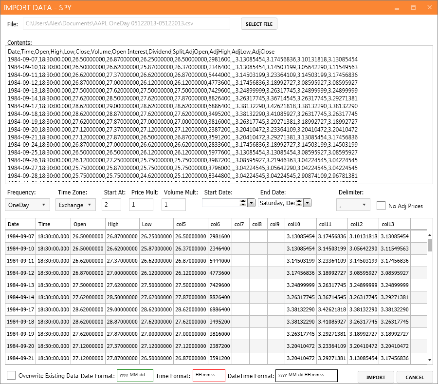
The QUSMA Data Management System (QDMS) is an application for acquiring, managing, and distributing low-frequency historical and real-time data, written in C#.
QDMS uses a client/server model. The server acts as a broker between clients and external data sources. It also manages metadata on instruments, and local storage of historical data. Finally it also functions as a UI for managing the metadata & data, as well as importing/exporting data from and to CSV files.
Currently it supports two external data sources: Interactive Brokers and Yahoo, but I’ll be adding more in the future.
Note that it’s not “production-ready” right now. There are still a few bugs to iron out, and it also uses unstable 3rd party libraries (the alpha version of the MySQL .NET connector, because it’s the only one that supports Entity Framework 6). All the “core” functionality is implemented and functional, however.
You can find the code here: https://github.com/qusma/qdms. I’m releasing it under the permissive BSD License. Contributions by way of pull requests are more than welcome. If you’d like to make any feature requests or just flame me for the quality of my code, leave a comment right here.
I personally use it in my backtester and portfolio performance evaluation applications, and I’m in the process of integrating it with my live trading app as well.
Using the client is easy, let’s take a look at some code examples:
Getting a list of all instruments:
List<Instrument> instruments = client.FindInstruments();
Searching for a specific instrument, for example SPY:
Instrument spy = client.FindInstruments(new Instrument { Symbol = "SPY" }).FirstOrDefault();
Requesting historical data:
var histRequest = new HistoricalDataRequest(
                    spy,
                    BarSize.OneDay,
                    new DateTime(2013, 1, 1),
                    new DateTime(2013, 1, 15));

client.RequestHistoricalData(histRequest);
Requesting real time data:
var rtRequest = new RealTimeDataRequest(spy, BarSize.OneSecond);
client.RequestRealTimeData(rtRequest);
Some screenshots:

Instrument metadata.

Adding a new instrument from Interactive Brokers.

Importing data from a CSV file.

Main server screen.
Read more The QUSMA Data Management System Is Now Open Source
Part 1 covered the relation between VIX/WVF extreme movements and SPY; here we take a wider look, covering a large number of international equity ETFs.
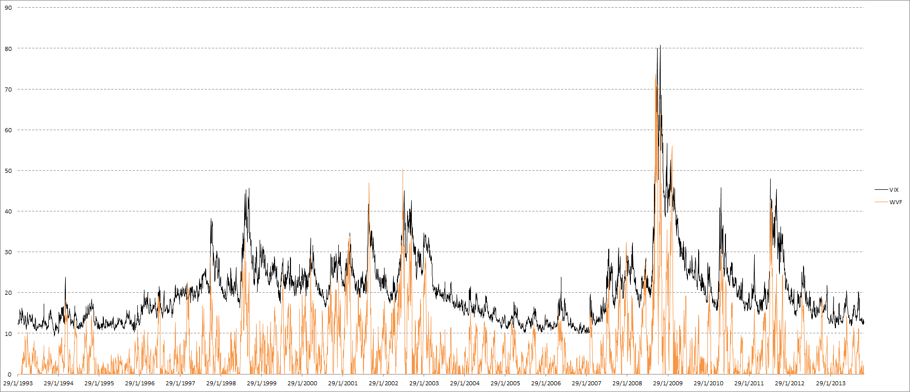
The main idea behind WVF is that it acts similarly to VIX in high-volatility situations, possibly enough to serve as an implied volatility substitute in cases where such an index does not exist. It can be useful to “confirm” signals based on implied volatility, or to replace them completely in cases where no implied volatility index exists. First of all let’s take a look at an updated VIX & SPY WVF chart:

VIX & SPY WVF
The first post was a while ago, so let’s check how VIX and WVF have performed for SPY since then. The number of signals is very small, and WVF alone has underperformed compared to its historical results, but once again we see that the combination of VIX and WVF offered by far the best results:

Signal results on SPY since 25 Oct. 2012
Let’s take a look at how these signals work internationally:

Close-to-close returns following 100-day 99th percentile VIX return.
It’s clear that using only VIX is pretty useless. Overall the returns are not significantly different from zero, and are even negative in many cases. Let’s check out WVF, which appears to work far better across most ETFs:

Close-to-close returns following 100-day 99th percentile WVF change.
Finally, when VIX and WVF extreme movements coincide, the results look fantastic:

Simultaneous VIX and WVF extreme movements.
Note that even in cases where WVF alone did not show good results (the VT and WVF ETFs for example), combining VIX and WVF still results in great improvement. There is an important, general lesson here about using non-price data as trade set-ups. With few exceptions, implied volatility, breadth, seasonality, etc. need to be “confirmed” by price to actually be useful.
Read more Equity Returns Following Extreme VIX and WVF Movements, Part 2
Half a year ago I posted about writing my own backtesting platform. While it has been even more challenging than I thought it would be, it’s going well: about 95% of “core” functionality has been implemented. Early on I realized I should design a completely separate, centralized, data management system that I could use with all my trading applications.
The QUSMA Data Management System (QDMS) works as a centralized data access point: it connects clients to external historical/real time data sources, manages metadata on instruments, and also provides local storage for historical data.
I was heavily influenced by the MultiCharts approach, though my own system is of course a bit less complex. I based a lot of the instrument metadata management as well as some of the UI design on the MC “QuoteManager” application as I think their approach is quite intuitive.

The system is designed in a modular fashion so it’s trivial to add additional data sources (as well as alternative local storage mechanisms…if I ever start storing tick data I will have to move away from my current relational database storage mechanism). The interfaces for writing external data source modules are very simple right now:

Interfaces for data storage and external data sources.
A couple screenshots of the server interface:

Importing/exporting CSV files is already implemented.

Editing instrument metadata, including custom sessions. Instruments can have custom data sessions, or they can derive their sessions from their exchange, or a template.
There’s also the client side of things, here’s the interface for selecting data series in the backtester:

Selecting data series for a backtesting run.
The client/server approach lets multiple clients use the same data stream. For example, if computations are distributed over multiple boxes and each client needs access to the same real time data, only a single connection to the external data source is required: the data is then distributed by the broker to every client that has requested that stream.
There is also the ability to push data into the local storage. One possible use for this is saving results from a backtest, then using that equity curve as a benchmark in a performance evaluation application.
I’m probably going to open source this project eventually, but right now I’m using a couple of proprietary libraries that prevent me from distributing it. It’ll take a bit of work to “disentangle” those bits. In any case I’m striving to comment well and write in a good style so that opening up the code will be relatively painless.
I learned a ton writing the QDMS because it was an opportunity to use a bunch of interesting libraries and technologies that I had never touched before: ZeroMQ, Protocol Buffers, the Entity Framework, WPF, NLog, and Reactive Extensions. I was amazed at the performance of ZMQ: out of the box, in a simple test using a single socket and a single thread, it managed to transfer nearly 200 OHLC bars per millisecond.
There’s still a bit of work to be done: one major issue is that there is no way to construct lower-frequency bars from higher-frequency data (e.g. daily bars made from 1-minute data), and only time-based bars are possible. The biggest missing piece however is generating continuous futures data. It’s a much harder problem than it seems at first glance because it’s necessary to incorporate a great deal of flexibility both in terms of the futures expiration rules and the rollover rules.

Continuous futures class.
I haven’t done any actual research in quite a while because I’ve been preoccupied with coding but I’ll be back soon! I’ve been accumulating a giant backlog of ideas that are waiting to be tested. Hopefully my new tools will be good enough to give some special insights. In any case, I can’t wait to get started.
Read more Creating a Data Management System
Volatility- and drawdown-adjusted returns are the most commonly used values to judge the performance of a trader or a backtest. However, neither of those truly measures the consistency of the returns. Long periods of low-volatility, sideways movement in an equity curve are obviously undesirable, but do are not shown in the Sharpe or MAR ratios. Instead, we need to look at specialized consistency (or “straightness”) metrics.
There are of course some “standard” straightness metrics. R-squared is the most popular, and it works pretty well. I like to raise it to the 4th power or so in order to magnify small differences and make it a bit more “readable”. Another popular metric is the K-Ratio, of which there are at least 3 different versions floating around. The K-Ratio also takes returns into account, so it’s not purely a straightness measure. I prefer the Zephyr version which is calculated as the slope of the equity curve divided by its standard error.
Let’s see if we can construct some alternatives. To start out, we need a benchmark to measure straightness against. That is the “ideal line”. It is the straight line that connects the first and last points of the equity curve. The further away the equity curve is from the ideal, the less desirable it is.

Equity curve, ideal line, and the difference between them.
There are certain obvious principles we can derive from this simple analysis:
- We want to minimize the area of deviation from the ideal line.
- The further away we are from the ideal, the worse (non-linearly).
- Being below the ideal is worse than being above it.
- Being below the ideal for long periods of time is undesirable.
We can easily quantify these ideas into a useful measure of equity curve straightness by using numbers such as the total area of deviation from the ideal, the volatility of the deviation, the length of time spent below the ideal, etc.
An interesting heuristic to look at is the number of times the equity curve crosses the ideal line. The closer the equity tracks the ideal line, the more times it will cross it. This metric fails in idealized tests, but works well in real-world scenarios. It also tends to fail when there are few trades in the sample. Divide the number by the total number of observations in the sample to standardize it.
A similar metric is the average drawdown length. Perhaps it is even more useful because presumably long deviations below the ideal are more important than deviations above it, and the number of crosses does not differentiate between the two.
Some other numbers I think may be interesting: the ratio between the area of difference above and below the ideal, the volatility of the difference, the volatility of the difference below the ideal, average absolute deviation, and average absolute deviation below the ideal (both standardized to the magnitude of the curve).
I created a metric that arbitrarily and haphazardly combines some of the above concepts, and I’m calling it the QUSMA Equity Curve Straightness, Downward Deviation, and Stability Measure (QECSDDSM, pronounced /keɪks-du-sʌm/). It is intended purely as a straightness measure, and does not take into account returns or the slope of the equity curve. It is calculated as follows (see the excel file at the bottom to make sense of it):

Let’s take a look at some extreme examples:

 First of all, note that both the Sharpe ratio and the MAR ratio would select the “wrong” strategy if they were used naively: they both prefer Series 3 & 4 over Series 2. Both the K-Ratio and QECSDDSM correctly prefer the first two. Note that the number of crosses is a useless metric here because the most perfect line has very few of them, simply due to being “too straight”. The ratio of the areas above and below the idealized line is not very useful in these scenarios because they are so extreme.
In general most of the numbers roughly agree with each other in terms of ordering the curves from best to worst, so the actual formulation of QECSDDSM doesn’t really matter all that much.
Let’s look at a slightly more realistic assortment of equity curves:


In this case the intuition behind the number of crosses metric becomes obvious. Interestingly QECSDDSM is the only metric to prefer Series 4 to Series 3, which I think is undesirable. Series 4 highlights a problem with the metrics that measure volatility or focus on the area below the ideal: simply having very few trades “gets around” them and produces an overly-high score. Again the Sharpe and MAR ratios produce an “incorrect” ranking by preferring Series 3 to Series 2. The difference mainly comes from the fact that the curve is not very volatile and does not spend a lot of time below the ideal. Some fine tuning of the parameters should smooth things out pretty easily, though.
Another potentially interesting approach to the issue would be to do some sort of regime change detection on the returns (here’s one simple approach). A straight curve will obviously have fewer changes in the average of the returns.
Finally, here’s an excel file that you can play around with.
Read more Equity Curve Straightness Measures
The .NET ecosystem is rich with excellent, free libraries that cover pretty much everything you need when writing trading software. So here’s a collection of libraries I use in my applications, mostly focused on stats, math, and machine learning but also including time handling, data structures, and calendars:
Based on the Aforge.NET library, it offers tons of useful stuff for traders: matrices, descriptive statistics, probability distributions, optimization methods, regression, PCA, as well as a wide array of machine learning algorithms. I use it all the time.
Tons of useful math and stats functions, matrices & linear algebra (very fast), PCA, regression, unsupervised machine learning.
Probability distributions & random number generation, linear algebra, simple statistical analysis, various useful math functions.
Various extremely useful data structures: double ended queue, dictionary with multiple values per key, red-black tree, ordered dictionary/list.
A port of quantlib to C#. Not just derivatives, there’s a lot of useful stuff in here such as calendars with holidays for a very wide array of markets. There’s also NQuantLib which I haven’t tried.
Time handling done right. You need this.
Lets you use R from your .NET applications. Slow, buggy as hell, hard to work with, but some times it’s very useful to have access to some of the more obscure/specialized R libraries.
Regression, some machine learning, PCA, optimization, and linear algebra, simple hypothesis testing.
There are several commercial options available as well, such as Extreme Optimization and NMath. I haven’t used either of them so I can’t comment on their quality.
Read more Useful and Free C#/.NET Libraries for Traders
I finally finished the first draft of my IBS paper. The results are quite interesting and extremely relevant if you trade equity ETFs. You can read it here.
Abstract:
I investigate mean reversion in equity ETF prices at the daily frequency by employing a simple technical indicator, Internal Bar Strength (IBS). IBS is based on the position of the day’s close in relation to the day’s range. I use it to forecast close-to-close returns with statistically and economically significant results for most instruments. A simple strategy based on IBS generates an average alpha of over 30% p.a. before transaction costs. I show that equity index ETFs have had strong and consistent mean reverting tendencies since the 90s, and that these effects can be exploited as part of a profitable trading strategy. The IBS effect is stronger during times of high volatility, in bear markets, after high-range days, after high-volume days, and early in the week.
Feedback is highly appreciated, either in the comments below or by email to qusmablog at gmail dot com.
Some of the interesting things you’ll find within:

IBS plotted against average close-to-close returns.

Cumulative NQ returns at 5 minute intervals after IBS < 0.2 at 15:00 CT.

Equity curves of a simple RSI(3) strategy on QQQ, with and without IBS filter.
Update: the comparison chart for the Australian ETF now correctly uses EWA instead of EWO (the Austrian ETF).
Read more New Paper: The IBS Effect: Mean Reversion in Equity ETFs
The second, and probably final, followup to the Mining for Three Day Candlestick Patterns post. Previously, we improved performance by adding more data to the search. In this post we’ll try to improve the system further by combining multiple predictors. The central question is how to combine the forecasts. I test averaging, weighted averaging, regression, and a voting scheme and compare them against a baseline one-predictor strategy.
Set-Up
Combining predictors is a standard tactic in machine learning, but the case of k-NN predictors is a bit of an outlier. Typical ensemble methods depend on generating variations in the data set in order to generate different and complementary predictors (as in the cases of boosting and bagging). This doesn’t work very well with nearest neighbor predictors, however, because they tend to be insensitive to variations in the data set. So what can we vary? The choice of k, the choice of inputs, the choice of distance measure for the nearest neighbors, and some pre-processing options such as whether to adjust for volatility or not.
I am not going to make any variation in outputs as that’s reserved for a post of its own. The idea is pretty simple: it’s essentially a random forest with k-NN predictors instead of decision trees (here’s an interesting paper on it).
So we’re left with k, sum of absolute or sum of square distances, and volatility adjustment. I picked 10 combinations of these options:

The k values were picked at random and I’m sure it’s possible to do better by optimizing them using cross validation.
The signals obviously overlap significantly, and have similar stats when used one-by-one:

Long signal stats. Long position threshold: forecast > 5 basis points & IBS < 0.5.

Short signal stats. Short position threshold: forecast < -10 basis points & IBS > 0.5.
The instrument traded is SPY. Additional data is taken from the following instruments for the pattern search: EWY, EWD, EWC, EWQ, EWU, EWA, EWP, EWH, EWL, EFA, EPP, EWM, EWI, EWG, EWO, IWM, QQQ, EWS, EWT, and EWJ. The thresholds in each case are adjusted to result in a similar length of time spent in the market. Position sizing is done based on the 10-day realized volatility of SPY, as described in this post: leverage is equal to 20% divided by 10-day realized annualized standard deviation, with a maximum leverage of 200%. Finally, an IBS filter is applied that allows long positions only when IBS < 0.5 and short positions only when IBS > 0.5.
The baseline is the PF3 predictor: k = 75, square distance measure, no volatility adjustment. Here’s the equity curve:

PF3 predictor equity curve. $0.005 per share in commissions.
Averaging
The simplest approach is obviously to just average the 10 forecasts and then use the average value to generate trades. A long position is taken when the average forecast is greater than 15 basis points, and a short position when the average is smaller than -12.5 basis points. Here’s what the equity curve looks like:

Equity curve using average forecast. $0.005 per share in commissions.
It’s interesting to note that the dispersion of forecasts is inversely related to the accuracy of the average: the smaller the standard deviation of the forecasts, the more accurate they are. Unfortunately effect is marginal and thus not particularly useful for improving the strategy.
Weighted Averaging
A simple extension, that generates slightly better stats, is to weigh each forecast before averaging. There’s a wide array of stats one can use here (Sharpe/Sortino/MAR ratios are obvious candidates); I picked the mean square error. The inverse of the MSE becomes the forecast’s weight, so that smaller errors result in greater weights. The same thresholds as above are used to generate signals. The weights provide a slight improvement both in terms of Sharpe and MAR ratios. The equity curve:

Equity curve using weighted average forecast, with weights equal to the inverse of the mean square error. $0.005 per share in commissions.
Voting
Using a threshold for each forecast, (>5 basis points for a “long” vote, and <-10 basis points for a “short” vote), each predictor is assigned a long or short vote. The overlap between the votes is significant, between 88% and 97% for different estimators. How many votes should we require for a trade? It quickly becomes obvious that simple majority voting isn’t enough, as only near-unanimous decisions provide worthwhile predictions. The average next-day return when there are between 1 and 8 long votes is 0.4 basis points. The average return after 9 or 10 long votes is 23 basis points.
The resulting equity curve looks like this:

Equity curve using voting system. 9 or more votes required to take a position. $0.005 per share in commissions.
Ordinary Least Squares
It’s also possible to combine the forecasts using regression, with next-day returns as the dependent variable and the k-NN predictor forecasts as the independent ones.
The distribution of forecasts with OLS is very tightly clustered around 0, and for some reason higher forecasts are not associated with higher next-day returns (as they are for the 3 methods above). I don’t really understand why this is the case. The thresholds for trades are 0.5 basis points for a long trade, and -0.5 basis points for a short trade.
An issue here is, of course, multicollinearity due to the similarity of the independent variables. This can lead to, among other problems, overfitting (which is usually characterized by very large absolute values of the coefficients). Using ridge regression solves that issue by limiting the absolute value of coefficients.
A potentially interesting idea would be to constrain the coefficients to positive values, which might lessen the overfitting effects and also make much more sense on an intuitive level (after all, we know all the forecasts are similarly accurate, so negative coefficients don’t make much sense).

Equity curve using OLS regression. $0.005 per share in commissions.
Ridge Regression
If multicollinearity is a significant problem, we can use ridge regression to solve it. It offer significant improvement over the OLS approach, but it still fares badly compared to the one-predictor case. The same thresholds as in the OLS approach are used. Here’s the equity curve:

Equity curve using ridge regression. $0.005 per share in commissions.
Stats
Here are the stats for the single-predictor base case and all the combination methods:

All of them other than the voting failed horribly. I’m not sure why, but it’s good to know. The improvement provided by the voting system is sizable, however. Not only does the voting-based strategy achieve significantly higher risk-adjusted returns, it does it while spending 15% less time in the market. Those results are also easy to improve on by simply adding more predictors. The marginal gain from each new predictor will be diminishing, but there is definitely more value to wring out of it. And this is just with 3-day patterns: we can easily add 2 and 4 day patterns into the mix as well.
Other Possibilities
A wide array of machine learning methods can be used to combine predictions. Especially if the number of forecasts grew larger, techniques such as random forests or ANNs would be interesting to investigate. As long as simpler methods work very well I think there is little reason to increase the complexity (not to mention the opaqueness) of the strategy.
Read more k-NN Candlestick Pattern Search Extensions: Combining Forecasts
This is a followup to the Mining for Three Day Candlestick Patterns post. If you haven’t read the original post, do so now because I’m not going to repeat the basic mechanics of the strategy. While the approach was somewhat fruitful, it also had some obvious problems: it only seems to work in bearish or high volatility market regimes, and it couldn’t produce good short signals. The main idea I had to resolve these issues was simply to get more data.

Original strategy using only SPY data. Note long stretches of flat results.
That is easier said than done. Could we use mutual funds or index values to extend the dataset backwards? No, because the daily high/low values are inaccurate. The only alternative we are left with is using data from other instruments. So I picked a broad selection of equity ETFs to include: EWY, EWD, EWC, EWQ, EWU, EWA, EWP, EWH, EWL, EFA, EPP, EWM, EWI, EWG, EWO, IWM, QQQ, EWS, EWT, and EWJ.
The selection was comprehensive and unoptimized. I think you could do some sort of walk-forward optimization that picks the best combination of securities to include in the data set. I’m not sure how much that would help.
The additional data worked fantastically well, resolving both problems. The number of opportunities to trade increased significantly, long signals work very nicely under all market conditions, and predicting negative returns works far better. There was also an unexpected benefit: far less time is needed before the forecasts become usable. In the original implementation I waited 2000 days before starting to use the forecasts. With the extended data set this can be cut to 500, thus letting the backtest cover a longer period.
Performance-wise there were no problems, as the Accord .NET k-d tree implementation that I use is very quick. Finding the nearest 75 points in a data set of approximately 100,000, in 11 dimensions, takes less than 2 milliseconds on my overclocked 2500K.
The settings used in the search are simple: the length of the patterns is 3 days, the 75 closest ones are used to construct a forecast by averaging their next-day returns, and distance is calculated as the sum of squared distances in every dimension. Trades are taken when the forecast is above/below a certain threshold. They are then passed through a filter which only allows long positions when IBS < 0.5 and short positions only when IBS > 0.5.
It should be noted that using traditional measures of “fit” does not work very well with pattern matching. Adding the above instruments actually increases the RMSE, despite significantly increasing the trading performance of the forecasts.
A look at forecasts vs realized next-day returns:

PatternFinderMultiInput (x-axes) vs next day returns (y-axies), for IBS < 0.5 and forecast > 0
An important aspect to note is that even marginally positive forecasts work very well. For example, with the extended dataset, forecasts between 5 and 10 basis points resulted in an average 21 bp return the next day. On the other hand, using SPY data only, the return for those forecasts was just 5 basis points. What this means is that there are many more trades to take, which is what allows the strategy to do well in all market environments. Here’s the long-only equity curve:

Long position taken when IBS < 0.5 and forecast > 5 basis points. $0.005 per share in commissions.
A couple of charts to analyze the sensitivity of the long-only strategy’s results to changes in inputs (IBS limit and minimum forecast limit):

The additional data also has the benefit of making shorting possible. The equity curve doesn’t look as good, but it’s still a giant improvement over zero predictive ability on the short side:

Short position taken when IBS > 0.5 and forecast < -20 basis points. $0.005 per share in commissions.
Finally, the long and short strategies combined, along with the stats:

Long and short strategies above combined. $0.005 per share in commissions.

The concept also seems to work for stocks. For example, I tested a long-only strategy on AAPL, using the same settings as above, both with and without the addition of MSFT data. The Microsoft data improved every aspect of the results, with surprisingly consistent performance over nearly 20 years:

It would be interesting to try to apply this on a more massive scale, by increasing the data set to something like all S&P 500 stocks. Some technical restrictions prevent me from doing that right now, but I’ll come back to the idea in the future.
Read more k-NN Candlestick Pattern Search Extensions: More Data


 Others did really poorly:


