The ISEE sentiment index is the ratio of opening long call options to opening long short options. The idea is that the greater the ratio of calls, the more bullish the sentiment, and that this is a more reliable indicator (compared to other sentiment indices) because it’s based on actual trades as opposed to surveys. Compared to the AAII sentiment numbers it also has the enormous advantage of being available almost in real time, instead of updating once a week. Keep in mind though that it’s only based on trades on the ISE rather than the entire market.
There are a couple of different versions: one for all securities, one for equities only, and one that’s ETFs only. I will be using the equity ISEE for this post. Can we use it to trade? Let’s start with some charting. Here’s ISEE plotted against SPY:
Visual inspection seems to suggest a contrarian trading strategy, as bottoms in the ISEE tend to correspond to bottoms in SPY. But is there a way to pick out the bottoms and create a profitable trading strategy?
The actual level of the ISEE index is not strongly predictive of returns. Higher levels are associated with slightly higher next-day returns for SPY (so the contrarian intuition was probably off), but the effect is nowhere near large enough to trade on. The same holds for predicting returns over longer periods.
Red bars = N, blue bars = next-day close-to-close SPY return, grouped by ISEE value
I was also unable to to find a way to pick out good trades based on ISEE n-bar lows, n-bar percentile, and other similar approaches to picking out extreme lows. I also looked into whether bounces after lows were good entry points, but again no luck.
Could we use it for risk management? There’s a slight relation between ISEE extremes (both high and low) and more unexpected future volatility, but it’s not very strong so again I wouldn’t use it.
Sentiment as a Filter?
What about using it as a filter to improve another trading strategy? Here it may have some potential, in a “go with the crowd” type of approach. Here’s a super simple strategy, if RSI(3)<20 at the close, it buys SPY and then sells at the next close. The strategy earns 19bp per day it spends in the market (without taking into account commissions). Filtering out the days when ISEE is below the 20th percentile of its values over the past 50 days improves the returns to 29bp and significantly reduces risk. This also works on the opposite side, as low ISEE values tend to be more favorable for shorts.
But the effect is marginal and given the lack of predictive ability the ISEE has otherwise, I wouldn’t really trust it to work reliably in the future. Overall this is probably not something I would use.
Why are overnight periods riskier? For one, you can’t use stops to limit your risk. But more importantly, the distribution of overnight returns has far more extreme negative returns than the intraday or close-to-close periods. Let’s take a look at some stats on close-to-open, open-to-close, and close-to-close returns for SPY:
Some definitions:
Skew: negative skew means longer tails on the negative side.
Kurtosis: higher kurtosis means heavier tails (the normal distribution has a kurtosis of 3).
First of all, overnight returns are not that volatile. But per-unit-volatility, they are far riskier due to the higher frequency of extreme returns. I calculated the magnitude of returns in terms of standard deviations (based on 10-day realized volatility), and overnight returns have a 5 standard deviation move more than twice as frequently as close-to-close returns. You can expect a 5SD overnight move about once a year.
Here’s a histogram of close-to-close returns and close-to-open returns. You can clearly spot the skewness around the -6% to -3% area. The value on the far left is from Oct 24 2008. Also note that just because the skewness is negative doesn’t mean that short positions are safe: the tails of the overnight returns are heavy on the right side as well.
Close-to-open returns were adjusted to have the same volatility as the close-to-close returns to make the comparison a bit easier
Market Regimes
These risks are about the same in bull and bear markets. On the other hand they seem to be smaller in high-volatility environments (possibly a side-effect of mean-reverting volatility). When SPY’s 20-day realized volatility is above 20%, the tail risks of overnight returns are about the same as those of close-to-close returns. But this isn’t all that helpful, because after all in times of high volatility your position sizing is already limited.
The Weekend
The weekend is a special case of even higher risk; you can’t treat it like other overnight periods. It’s more volatile, and features even more frequent extreme losses. In my own position sizing I always put additional limits on trades over the weekend.
Concluding Thoughts
Different instruments behave in different ways, especially when it comes to different asset classes. Overnight dangers tend to be relatively larger for stocks compared to indices. So make sure that your sizing is adapted to the unique characteristics of the instruments that you’re trading.
As a rule of thumb I’d say that given an equal volatility exposure, overnight returns expose you to about ~1.5-2x risk of extreme negative returns, while the weekend exposes you to 2-2.5x risk of extreme negative returns. But does this mean that you should halve any overnight trades that you enter on Fridays? Not necessarily. There is no perfect answer to this dilemma: different traders and different strategies will have different views on how much they are willing to trade returns for less extreme moves. The important part is to quantify the trade-off so that you know exactly how much you’re giving up and how much risk you’re taking on.
Assume you have a bunch of different systems that trade stocks, equity index ETFs, bond ETFs, and some other alternative assets, eg commodity ETFs. All the systems take both long and short positions. What are the questions your portfolio optimization approach must answer? This is a post focused on high-level conceptual issues rather than implementation details.
Do I want market factor exposure?
By “market factor” I refer to the first component that results from PCAing a bunch of equities (which is similar but not identical to the first factor in all the different academic factor models). In other words it’s the underlying process that drives global equity returns as a whole.
Case A: Your system says “go long SPY”. This is simple: you do want exposure to the market factor. This is basically a beta timing strategy: you are forecasting a positive return on the market factor, and using the long SPY position to capture it. Risk management basically involves decreasing your SPY exposure until you hit your desired risk levels.
Case B: Your system says “go long SPY and short QQQ”. Suddenly this is not a beta timing strategy at all, but something very different. Clearly what we care about in this scenario is relative performance of the unique return components of SPY and QQQ. Therefore, we can think about this as a kind of statistical arbitrage trade. The typical approach here is to go beta neutral or dollar neutral, but naive risk parity is also reasonable.
Case C: Your system says:
Go long SPY
Go long EFA
Go long AAPL
Go long AMZN
Go short NFLX
I’m going long the entire world, and short NFLX. This looks more like a beta timing trade (Case A) rather than a statarb-style trade (Case B), because the number and breadth of the trades concentrated on the long side indicate a positive return on the market factor. I probably don’t want to be beta neutral in this case. Not every instance of long/short equity trades can be boiled down to “go market neutral”. So how do we determine if we want to be exposed to the market factor or not?
One intriguing solution would be to create a forecasting model on top of the strategies: it would take as input your signals (and perhaps other features as well), and predict the return of the market factor in the next period. If the market factor is predicted to rise or fall significantly, then do a beta timing trade. If not, do a beta-neutral trade. If such forecasting can add value, the only downside is complexity.
Is the market factor enough?
Let’s say you trade 5 instruments: 3 US ETFs (SPY, QQQ, IWM), a Hong Kong ETF (EWH), and a China ETF (FXI). Let’s take a look at some numbers. Here are the correlations and MDS plot so you can get a feel for how these instruments relate to each other:
Correlations
MDS plot
PCAing their returns shows exactly what you’d expect: the first component is what you’d call the market factor and all the ETFs have a similar, positive loading. The second component is a China-specific factor.
PCA – Factor Loadings
And here’s the biplot:
Case D: Your systems say:
Go long SPY
Go long EWH
Go short FXI
In this situation there is no practical way to be neutral on both the global market factor and the China-specific factor. To quickly illustrate why, consider these two scenarios of weights and the resulting factor loadings:
Weights
Factor Loadings
SPY
EWH
FXI
PC1
PC2
0.45
0.5
-1
0.01
-0.39
0.5
0.65
-0.4
0.35
-0.01
Should we try to minimize both? Should we treat EWH/FXI as an independent statarb trade and neutralize the China factor, and then use our SPY position to do beta timing on the global market factor? How do we know which option to pick? How do we automate this decision?
A similar problem comes up if we segment the market by sectors. It’s possible that your strategy has a selection effect that causes you to be overweight certain sectors (low volatility equity strategies famously have this issue), in which case it might be prudent to start with a per-sector risk budget and then optimize your portfolio within each sector separately.
If you’re running a pure statarb portfolio, this is an easy decision, and given the large number of securities in your portfolio there is a possibility of minimizing exposure not only to the market factor but many others as well. For more on how to practically achieve this, check out Valle, Meade & Beasely, Factor neutral portfolios.
Do I want exposure to other, non-equity factors?
Sometimes.
Let’s see what happens when we add TLT (20+ year treasuries) and GDX (gold miners) to our asset universe. Correlations and MDS:
PCA:
PCA – Factor Loadings
Some things to notice: as you’d expect, we need more factors to capture most of the variance. On top of that, the interpretation of what each factor “means” is more difficult: the first factor is still the market factor, but after that…my guess is PC2 is interest-rate related, and PC3 looks China-specific? In any case, I think the correct approach here is to be agnostic about what these factors “mean” and just approach it as a purely statistical problem.
At this point I also want to note that these factors and their respective instrument loadings are not stable over time. Your choice of lookback period will influence your forecasts.
Again we run into similar problems. If your systems say “go long GDX”, that looks like a beta timing play on PC2/3?/4?. But let’s say you are running two unrelated systems, and they give you the following signals:
Case E:
Long TLT
Short GDX
Should we treat these as two independent trades, or should we treat it as a single statarb-style trade? Does it matter that these two instruments are in completely different asset classes when their PC1 and PC2 loadings are so similar? Is it a relative value trade, or are we doing two separate (but in the same direction) beta-timing trades on PC4? Hard to tell without an explicit model to forecast factor returns. If you don’t know what is driving the returns of your trades, you cannot optimize your portfolio.
Do I treat all instruments equally?
Depends. If you go the factor-agnostic route and treat everything as a statistical abstraction, then perhaps it’s best to also be completely agnostic about the instruments themselves. On the other hand I can see some good arguments for hand-tailored rules that would apply to specific asset classes, or sub-classes. Certainly when it comes to risk management you shouldn’t treat individual stocks the same way you treat indices — perhaps this should be extended to portfolio optimization.
It also depends on what other instruments you include in your universe. If you’re only trading a single instrument in an asset class, then perhaps you can treat every trade as a beta timing trade.
How do I balance the long and short sides?
In a simple scenario like Case B (long SPY/short QQQ) this is straight-forward. You pick some metric: beta, $, volatility, etc. and just balance the two sides.
But let’s go back to the more complex Case C. The answer of how to balance the long and short sides depends on our earlier answer: should we treat this scenario as beta timing or statarb? The problem with the latter is that any sensible risk management approach will severely limit your NFLX exposure. And since you want to be beta (or $, or σ) neutral, this means that by extension the long side of the trade will also be severely limited even though it carries far less idiosyncratic risk.
Perhaps we can use the risk limits to determine if we want to be beta-neutral or not. If you can’t go neutral because of limits, then it’s a beta timing trade. Can you put your faith into such a hacky heuristic?
What do we do in situations where we’re having to balance a long/short portfolio with all sorts of different asset classes? Do we segregate the portfolio (by class, by factor loading?) in order to balance each part separately? As we saw in Case E, it’s not always clear which instruments go into which group.
How do I allocate between strategies?
So far we’ve been looking at instruments only, but perhaps this is the wrong approach. What if we used the return series of strategies instead? After all the expected returns distribution conditional on a signal being fired from a particular strategy is not the same as the unconditional expected returns distribution of the instrument.
What do we do if Strategy A wants to put on 5 trades, and Strategy B wants to put on 1 trade? Do we care about distributing the risk budget across instruments, or across strategies, or maybe a mix of both? How do we balance that with risk limits? How do we balance that with factor loadings?
So, to sum things up. The ideal portfolio optimization algorithm perfectly balances trading costs, instruments, asset classes, factor exposure (but only when needed), strategies, and does it all under constraints imposed by risk management. In the end, I don’t think there are any good answers here. Only ugly collections of heuristics.
This post was prompted by Michael Covel’s interview Traders’ Magazine in which he claims that trend followers don’t try to make predictions. This idea that trend followers do not forecast returns is widely and frequently repeated. It is also complete nonsense.
Every trading strategy makes forecasts1. Whether these forecasts are explicit or hidden behind entry/exit rules is irrelevant. All the standard trend following systems can trivially be converted into a forecasting model that predicts returns, because they are fundamentally equivalent.
The specific formulation of the trend following system doesn’t matter, so I’ll keep it simple. A typical trend following indicator is the Donchian channel, which is simply the n-bar highest high and lowest low. Consider a system that goes long when price closes above the 100-day Donchian channel and exits when price closes below the 50-day Donchian channel.
This is the equity curve of the system applied to crude oil futures:
This system can trivially be converted to a forecasting model of the form
the dependent variable y is returns, and x will be a dummy variable that takes the value 1 if we are in a trend, and the value 0 if we are not in a trend. How do we define “in a trend”? Using the exact same conditions we use for entries and exits, of course.
We estimate the parameters and find that α ≃ 0, and β = 0.099% (with p-value 0.013). So, using this trend following forecasting model, the expected return when in a trend is approximately 10bp per day, and the expected return when not in a trend is zero. Look ma, I’m forecasting!
Even without explicitly modeling this relationship, trend followers implicitly predict that trends persist beyond their entry point; otherwise trend following wouldn’t work. The model can easily be extended with more complicated entry/exit rules, short selling, the effects of volatility-based position sizing, etc.
Presenting the similarity between multiple time series in an intuitive manner is not an easy problem. The standard solution is a correlation matrix, but it’s a problematic approach. While it makes it easy to check the correlation between any two series, and (with the help of conditional formatting) the relation between one series and all the rest, it’s hard to extract an intuitive understanding of how all the series are related to each other. And if you want to add a time dimension to see how correlations have changed, things become even more troublesome.
The solution is multidimensional scaling (the “classical” version of which is known as Principal Coordinates Analysis). It is a way of taking a distance matrix and then placing each object in N dimensions such that the distances between each of them are preserved as well as possible. Obviously N = 2 is the obvious use case, as it makes for the simplest visualizations. MDS works similarly to PCA, but uses the dissimilarity matrix as input instead of the series. Here’s a good take on the math behind it.
It should be noted that MDS doesn’t care about how you choose to measure the distance between the time series. While I used correlations in this example, you could just as easily use a technique like dynamic time warping.
Below is an example with SPY, TLT, GLD, SLV, IWM, VNQ, VGK, EEM, EMB, using 252 day correlations as the distance measure, calculated every Monday. The motion chart lets us see not only the distances between each ETF at one point in time, but also how they have evolved.
Some interesting stuff to note: watch how REITs (VNQ) become more closely correlated with equities during the financial crisis, how distant emerging market debt (EMB) is from everything else, and the changing relationship between silver (SLV) and gold (GLD).
Here’s the same thing with a bunch of sector ETFs:
To do MDS at home: in R and MATLAB you can use cmdscale(). I have posted a C# implementation here.
When I was first starting out a couple of years ago I didn’t really track my performance beyond the simple report that IB generates. Eventually I moved on to excel sheets which grew to a ridiculous and unmanageable size. I took a look at tradingdiary pro, but it wasn’t flexible or deep enough for my requirements.
So I wrote my own (I blogged about it here): on the one hand I focused on flexibility in terms of how the data can be divided up (with a very versatile strategy/trade/tag system), and on the other hand on producing meaningful and relevant information that can be applied to improve your trading. Now I have ported it to WPF and removed a bunch of proprietary components so it can be open sourced. So…
I’m very happy to announce that the first version (0.1) of the QUSMA Performance Analytics Suite (QPAS) is now available. For an overview of its main performance analysis capabilities see the performance report documentation.
The port is still very fresh so I’d really appreciate your feedback. For bug reports, feature requests, etc. you can either use the GitHub issue tracker, the google group, or the comments on this post.
While the IB flex statements provide enough data for most functionality, QPAS needs additional data for things like charting, execution analysis, and benchmarking. By default it uses QDMS, but you can use your own data source by implementing the IExternalDataSource interface.
Currently the only supported broker is Interactive Brokers, but for those of you who do not use them, the statement importing system is flexible: see the Implementing a Statement Parser page in the documentation for more.
I should note that in general I designed the application for myself and my own style of trading, which means that some features you might expect are missing: no sector/factor attribution for stock pickers, no attribution stats for credit pickers, daily-frequency calculation of things like MAE/MFE (so any intraday trades will show zero MAE/MFE), and no options-specific analytics. All these things would be reasonably easy to add if you feel like it (and know a bit of C#), though.
And now for something completely different. A bit of macro and a bit of factor relative performance: what happens when yield spreads and small caps diverge from the S&P 500?
High Yield Spreads
First, let’s play with some macro-style data. Below you’ll find the SPY and BofA Merrill Lynch US High Yield Master II Option-Adjusted Spread (a high yield bond spread index) plotted against SPY.
Obviously the two are inversely correlated as spreads tend to widen in bear markets. Very low values are a sign of overheating. We’re still about 130 bp away from the pre-crisis lows, so in that regard the current situation seems pretty good. There’s a bit more to it than that, though.
First, divergences. When stocks keep making new highs and spreads start rising, it’s generally bad news. Some of the most interesting areas to look at are July ’98, April ’00, July ’07, and July ’11.
Also interesting is the counter-case of May ’10 which featured no such divergence: the Flash Crash may have been the driver of that dip, and that’s obviously unconnected to the macro situation in general and high yield spreads in particular.
So, let’s try to quantify these divergences and see if we can get anything useful out of them…on the chart above I have marked the times when both the spread and SPY were in the top 10% of their 100-day range. As you can see, these were generally times close to the top, though there were multiple “false signals”, for example in November ’05 and September ’06. Here are the cumulative returns for the next 50 days after such a signal:
Much of this effect depends on overlapping periods, though, so it’s not as good as it looks. Still, I thinks it’s definitely something worth keeping an eye on. Of course right now we’re pretty far from that sort of signal triggering as spreads have been dropping consistently.
Size: When Small Equities Diverge
Lately we’ve been seeing the Russell 2000 (and to some extent the NASDAQ) take a dip while the S&P 500 has been going sideways with only very small drawdowns. There are several ways to formulate this situation quantitatively. I simply went with the difference between the 20-day return of SPY and IWM. The results are pretty clear: large caps outperforming is a (slightly) bullish signal, for both large and small equities.
When the ROC(20) difference is greater than 3%, SPY has above average returns for the following 2-3 weeks, to the tune of 10bp per day (IWM also does well, returning approximately 16bp per day over the next 10 days). The reverse is also useful to look at: small cap outperformance is bearish. When the ROC(20) difference goes below -3%, the next 10 days SPY returns an average -5bp per day. Obviously not enough on its own to go short, but it could definitely be useful in combination with other models.
Another interesting divergence to look at is breadth. For the last couple of weeks, while SPY is hovering around all time highs, many of the stocks in the index are below their 50 day SMAs. I’ll leave the breath divergence research as an exercise to the reader, but will note that contrary to the size divergence, it tends to be bearish.
In other news I’ve started posting binaries of QDMS (the QUSMA Data Management System) as it’s getting more mature. You can find the link on the project’s page. It’ll prompt you for an update when a new version comes out.
The concept is essentially to use all the results from a brute force optimization and pick the median as the best estimate of out of sample performance. The first step is:
Parameter scan ranges for the system concept are determined by the system developer.
And herein lies the main problem. The scan range will determine the median. If the range is too wide, the estimate will be too low and based on data that is essentially irrelevant because the trader would never actually pick that combination of parameters. If the range is too narrow, the entire exercise is pointless. But the author provides no way of picking the optimal range a priori (because no such method exists). And of course, as is mentioned in the paper, repeated applications of SPP with different ranges is problematic.
To illustrate, let’s use my UDIDSRI post from October 2012. The in sample period will be the time before that post and the “out of sample” period will be the time after it; the instrument is QQQ, and the strategy is simply to go long at the close when UDIDSRI is below X (the value on the x-axis below).
As you can see, the relationship between next-day returns and UDIDSRI is quite stable. The out of sample returns are higher across most of the range but that’s just an artifact of the giant bull market in the out of sample period. What would have been the optimal SPP range in October 2012? What is the optimal SPP range in hindsight? Would the result have been useful? Ask yourself these questions for each chart below.
Let’s have a look at SPY:
Whoa. The optimum has moved to < 0.05. Given a very wide range, SPP would have made a correct prediction in this case. But is this a permanent shift or just a result of a small sample size? Let’s see the results for 30 equity ETFs1:
Well, that’s that. What about SPP in comparison to other methods?
The use of all available market data enables the best approximation of the long-run so the more market data available, the more accurate the estimate.
This is not the case. The author’s criticism of CV is that it makes “Inefficient use of market data”, but that’s a bad way of looking at things. CV uses all the data (just not in “one go”) and provides us with actual estimates of out of sample performance, whereas SPP just makes an “educated guess”. A guess that is 100% dependent on an arbitrarily chosen parameter range. Imagine, for example, two systems: one has stable optimal parameters over time, while the other one does not. The implications in terms of out of sample performance are obvious. CV will accurately show the difference between the two, while SPP may not. Depending on the range chosen, SPP might severely under-represent the true performance of the stable system. There’s a lot of talk about “regression to the mean”, but what mean is that?
SPP minimizes standard error of the mean (SEM) by using all available market data in the historical simulation.
This is true, but again what mean? The real issue isn’t the error of the estimate, it’s whether you’re estimating the right thing in the first place. CV’s data splitting isn’t an arbitrary mistake done to increase the error! There’s a point, and that is measuring actual out of sample performance given parameters that would actually have been chosen.
tl;dr: for some systems SPP is either pointless or just wrong. For some other classes of systems where out of sample performance can be expected to vary across a range of parameters, SPP will probably produce reasonable results. Even in the latter case, I think you’re better off sticking with CV.
Averaging financial time series in a way that preserves important features is an interesting problem, and central in the quest to create good “alpha curves”. A standard average over several time series will usually smooth away the most salient aspects: the magnitude of the extremes and their timing. Naturally, these points are the most important for traders as they give guidance about when and where to trade.
DTW Barycenter Averaging (or DBA) is an iterative algorithm that uses dynamic time warping to align the series to be averaged with an evolving average. It was introduced in A global averaging method for dynamic time warping, with applications to clusteringby Petitjean, et. al. As you’ll see below, the DBA method has several advantages that are quite important when it comes to combining financial time series. Note that it can also be used to cluster time series using k-means. Roughly, the algorithm works as follows:
The n series to be averaged are labeled S1…Sn and have length T.
Begin with an initial average series A.
While average has not converged:
For each series S, perform DTW against A, and save the path.
Use the paths, and construct a new average A by giving each point a new value: the average of every point from S connected to it in the DTW path.
You can find detailed step-by-step instructions in the paper linked above.
A good initialization process is extremely important because while the DBA process itself is deterministic, the final result depends heavily on the initial average sequence. For our purposes, we have 3 distinct goals:
To preserve the shape of the inputs.
To preserve the magnitude of the extremes on the y axis.
To preserve the timing of those extremes on the x axis.
Let’s take a look at how DBA compares to normal averaging, and how the initial average sequence affects the end result. For testing purposes I started out with this series:
Then created a bunch of copies by adding some random variation and an x-axis offset:
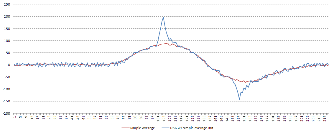
To start out, let’s see what a simple average does. Note the shape, the distance between peak and valley, and the magnitude of the minimum and maximum values: all far from the original series.
The simple average fails at all 3 goals laid out above.
Now, on to DBA. What are our initialization options? My first instinct was to try to start the process using the simple average, above. While this achieves goal #2, the overall shape is obviously wrong.
Petitjean et. al. recommend picking one of the input series at random. On the one hand this preserves the shape well, but the timing of the extremes depends on which series happened to be chosen. Additionally, a deterministic process is preferable for obvious reasons.
My solution was to use an input series for initialization, but to choose it through a deterministic process. I first de-trend every timeseries, then record the x-axis value of the y-axis maximum and minimum values for each series. The series that is closest to the median of those values is chosen. This allows us to preserve the shape, the y-axis extreme magnitudes, and get a good idea of the typical x-axis position of those extremes:
In the first part of the series we covered dynamic time warping. Here we look at clustering. K-means clustering is probably the most popular method, mainly due to its simplicity and intuitive algorithm. However it has some drawbacks that make it a bad choice when it comes to clustering time series. Instead, we’ll use K-medoids clustering.
The main conceptual difference between K-means and K-medoids is the distance used in the clustering algorithm. K-means uses the distance from a centroid (an average of the points in the cluster), while K-medoids uses distance from a medoid, which is simply a point selected from the data. The algorithms used for arriving at the final clusters are quite different.
K-medoid clustering depends on distances from k (in this case 2) points drawn from the data.
K-means distances are taken from a centroid which is created by averaging the points in that cluster.
How does K-medoids compare to K-means? It has several features that make it superior for most problems in finance.
K-medoids is not sensitive to outliers that might “pull” the centroid to a disadvantageous position.
K-medoids can handle arbitrary distance functions. Unlike K-means, there is no need for a mean to be defined.
Unlike K-means, K-medoids has no problems with differently-sized clusters.
K-medoids is also potentially less computationally intensive when the distance function is difficult to solve, as distances only need to be computed once for each pair of points.
Note that there’s no guarantee on the size of each cluster. If you want to, it’s trivial to add some sort of penalty function to force similarly-sized clusters.
The algorithm is simple:
Choose k points from the sample to be the initial medoids (see below for specific methods).
Give cluster labels to each point in the sample based on the closest medoid.
Replace the medoids with some other point in the sample. If the total cost (sum of distances from the closest medoid) decreases, keep this new confirugration.
Repeat until there is no further change in medoids.
Initialization, i.e. picking the initial clusters before the algorithm is run, is an important issue. The final result is sensitive to the initial set-up, as the clustering algorithm can get caught in local minimums. It is possible to simply assign labels at random and repeat the algorithm multiple times. I prefer a deterministic initialization method: I use a procedure based on Park et al., the code for which you can find further down. The gist of it is that it selects the first medoid to be the point with the smallest average distance to all other points, then selects the remaining medoids based on maximum distance from the previous medoids. It works best when k is set to (or at least close to) the number of clusters in the data.
An example, using two distinct groups (and two outliers):
Initial medoids with k=2.
The first medoid is selected due to its closeness to the rest of the points in the lower left cluster, then the second one is selected to be furthest away from the first one, thus “setting up” the two obvious clusters in the data.
Something I haven’t seen done but I suspect has potential is to cluster trades based on return, length, adverse excursion, etc. Then look at the average state of the market (as measured by some indicators) in each cluster, the most common industries of the stocks in each cluster, or perhaps simply the cumulative returns series of each trade at a reasonably high frequency. Differences between the “good trades” cluster(s) and the “bad trades” cluster(s) could then be used to create filters. The reverse, clustering based on conditions and then looking at the average returns in each cluster would achieve the same objective.
I wrote a simple K-medoids class in C#, which can handle arbitrary data types and distance functions. You can find it here. I believe there are packages for R and python if that’s your thing.