And now for something completely different. A bit of macro and a bit of factor relative performance: what happens when yield spreads and small caps diverge from the S&P 500?
High Yield Spreads
First, let’s play with some macro-style data. Below you’ll find the SPY and BofA Merrill Lynch US High Yield Master II Option-Adjusted Spread (a high yield bond spread index) plotted against SPY.
Obviously the two are inversely correlated as spreads tend to widen in bear markets. Very low values are a sign of overheating. We’re still about 130 bp away from the pre-crisis lows, so in that regard the current situation seems pretty good. There’s a bit more to it than that, though.
First, divergences. When stocks keep making new highs and spreads start rising, it’s generally bad news. Some of the most interesting areas to look at are July ’98, April ’00, July ’07, and July ’11.
Also interesting is the counter-case of May ’10 which featured no such divergence: the Flash Crash may have been the driver of that dip, and that’s obviously unconnected to the macro situation in general and high yield spreads in particular.
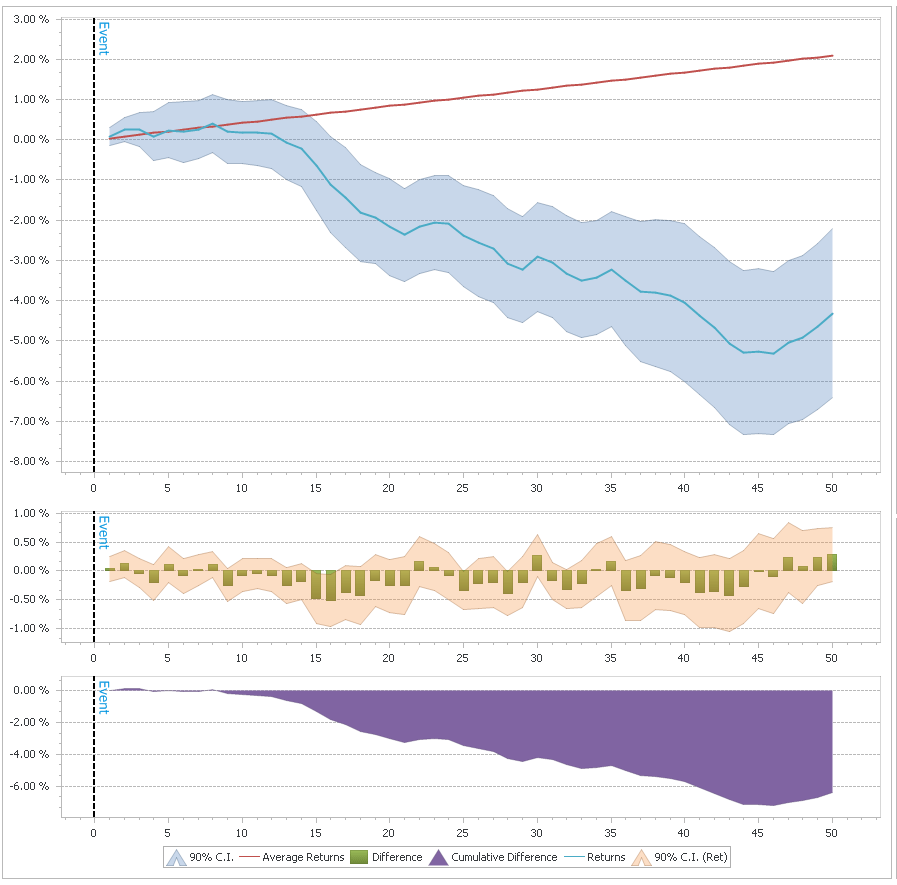
So, let’s try to quantify these divergences and see if we can get anything useful out of them…on the chart above I have marked the times when both the spread and SPY were in the top 10% of their 100-day range. As you can see, these were generally times close to the top, though there were multiple “false signals”, for example in November ’05 and September ’06. Here are the cumulative returns for the next 50 days after such a signal:

Much of this effect depends on overlapping periods, though, so it’s not as good as it looks. Still, I thinks it’s definitely something worth keeping an eye on. Of course right now we’re pretty far from that sort of signal triggering as spreads have been dropping consistently.
Size: When Small Equities Diverge
Lately we’ve been seeing the Russell 2000 (and to some extent the NASDAQ) take a dip while the S&P 500 has been going sideways with only very small drawdowns. There are several ways to formulate this situation quantitatively. I simply went with the difference between the 20-day return of SPY and IWM. The results are pretty clear: large caps outperforming is a (slightly) bullish signal, for both large and small equities.
When the ROC(20) difference is greater than 3%, SPY has above average returns for the following 2-3 weeks, to the tune of 10bp per day (IWM also does well, returning approximately 16bp per day over the next 10 days). The reverse is also useful to look at: small cap outperformance is bearish. When the ROC(20) difference goes below -3%, the next 10 days SPY returns an average -5bp per day. Obviously not enough on its own to go short, but it could definitely be useful in combination with other models.

Another interesting divergence to look at is breadth. For the last couple of weeks, while SPY is hovering around all time highs, many of the stocks in the index are below their 50 day SMAs. I’ll leave the breath divergence research as an exercise to the reader, but will note that contrary to the size divergence, it tends to be bearish.
In other news I’ve started posting binaries of QDMS (the QUSMA Data Management System) as it’s getting more mature. You can find the link on the project’s page. It’ll prompt you for an update when a new version comes out.
Read more Divergences: Yield Spreads and Size
Before you read this post, read the (Wagner award winning) Know Your System! – Turning Data Mining from Bias to Benefit through System Parameter Permutation by Dave Walton.
The concept is essentially to use all the results from a brute force optimization and pick the median as the best estimate of out of sample performance. The first step is:
Parameter scan ranges for the system concept are determined by the system developer.
And herein lies the main problem. The scan range will determine the median. If the range is too wide, the estimate will be too low and based on data that is essentially irrelevant because the trader would never actually pick that combination of parameters. If the range is too narrow, the entire exercise is pointless. But the author provides no way of picking the optimal range a priori (because no such method exists). And of course, as is mentioned in the paper, repeated applications of SPP with different ranges is problematic.
To illustrate, let’s use my UDIDSRI post from October 2012. The in sample period will be the time before that post and the “out of sample” period will be the time after it; the instrument is QQQ, and the strategy is simply to go long at the close when UDIDSRI is below X (the value on the x-axis below).
As you can see, the relationship between next-day returns and UDIDSRI is quite stable. The out of sample returns are higher across most of the range but that’s just an artifact of the giant bull market in the out of sample period. What would have been the optimal SPP range in October 2012? What is the optimal SPP range in hindsight? Would the result have been useful? Ask yourself these questions for each chart below.

Let’s have a look at SPY:

Whoa. The optimum has moved to < 0.05. Given a very wide range, SPP would have made a correct prediction in this case. But is this a permanent shift or just a result of a small sample size? Let’s see the results for 30 equity ETFs:

Well, that’s that. What about SPP in comparison to other methods?
The use of all available market data enables the best approximation of the long-run so the more market data available, the more accurate the estimate.
This is not the case. The author’s criticism of CV is that it makes “Inefficient use of market data”, but that’s a bad way of looking at things. CV uses all the data (just not in “one go”) and provides us with actual estimates of out of sample performance, whereas SPP just makes an “educated guess”. A guess that is 100% dependent on an arbitrarily chosen parameter range. Imagine, for example, two systems: one has stable optimal parameters over time, while the other one does not. The implications in terms of out of sample performance are obvious. CV will accurately show the difference between the two, while SPP may not. Depending on the range chosen, SPP might severely under-represent the true performance of the stable system. There’s a lot of talk about “regression to the mean”, but what mean is that?
SPP minimizes standard error of the mean (SEM) by using all available market data in the historical simulation.
This is true, but again what mean? The real issue isn’t the error of the estimate, it’s whether you’re estimating the right thing in the first place. CV’s data splitting isn’t an arbitrary mistake done to increase the error! There’s a point, and that is measuring actual out of sample performance given parameters that would actually have been chosen.
tl;dr: for some systems SPP is either pointless or just wrong. For some other classes of systems where out of sample performance can be expected to vary across a range of parameters, SPP will probably produce reasonable results. Even in the latter case, I think you’re better off sticking with CV.
Footnotes
Read more A Few Notes on System Parameter Permutation


